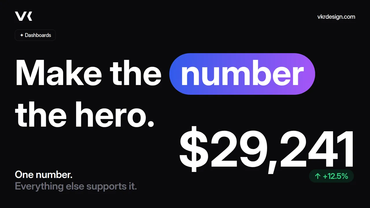
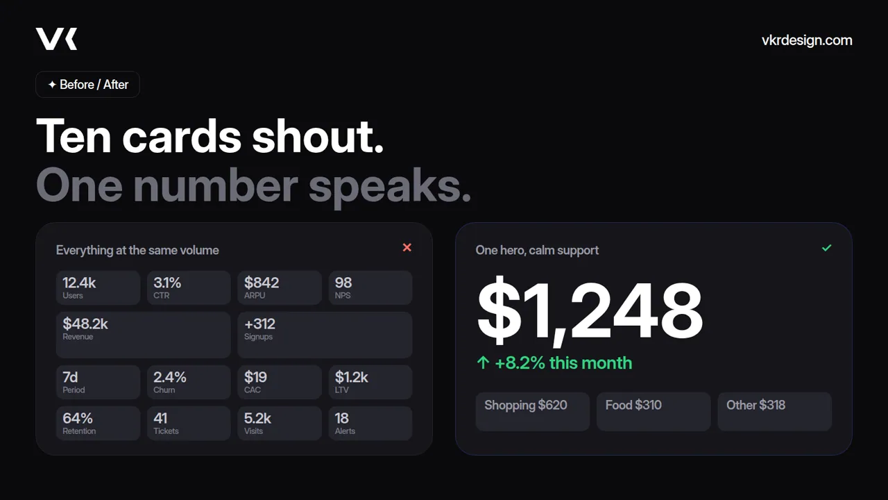
Most dashboards fail for a simple reason: everything on the screen is shouting at the same volume. Ten cards, six charts, three filters, and the user still asks, "So, how are we doing?"
Good dashboard design starts with one decision: what is the one number this screen exists to show? Everything else supports it.
1. Pick one key metric
Before opening Figma, finish this sentence: "When someone opens this screen, they should know ___ within two seconds."
In a finance app it is the total balance. In an analytics tool it is spend this month. In a SaaS admin panel it is active users or revenue. If you have three answers, you have three screens.
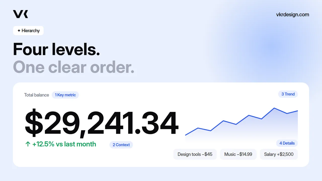
2. Build a clear hierarchy
Use size and contrast, not decoration, to rank information:
- Level 1: the key metric, largest type on the screen, high contrast.
- Level 2: context, such as the change versus last period (+12.5%) and a short label.
- Level 3: the trend, a simple line or bar that explains the number.
- Level 4: details, such as lists, categories and breakdowns.
If you blur your eyes and the number is not the first thing you see, the hierarchy is broken.
3. Show change, not just value
A number alone is trivia. A number with direction is information. Pair every key metric with a delta and a color signal: green for growth, red for decline, grey for neutral. Keep color meaning consistent everywhere.
4. Fewer clicks to the decision
A dashboard is not a report, it is a decision tool. Put the most common actions (send, transfer, export, filter by period) one tap away, near the number they affect. Hide the rest behind "More".
5. Make it feel calm
Calm interfaces build trust, especially in fintech and Web3:
- generous spacing and a strict grid;
- one accent color, with a second only for status;
- one typeface, with weight and size doing the work;
- soft surfaces instead of heavy borders and hard shadows.
6. Test it like a user
Show the screen to someone for five seconds, then hide it and ask what they remember. If they recall the number and its direction, the design works. If they recall the decoration, simplify.
What clients really pay for
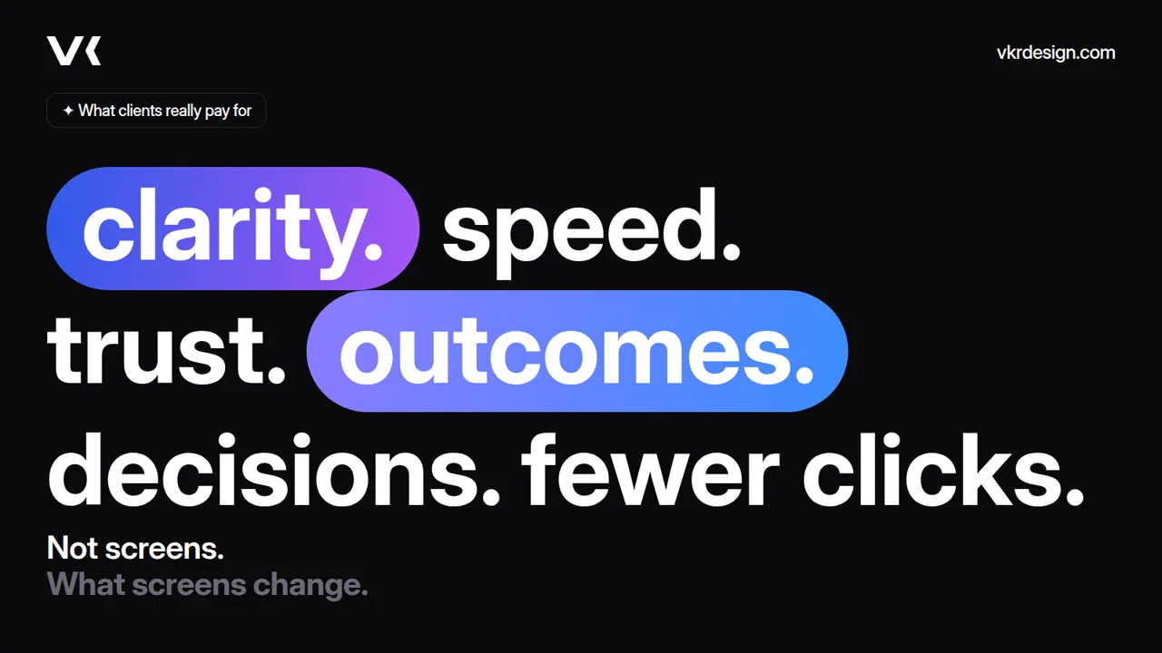
Clients do not pay for screens. They pay for clarity, speed, trust, outcomes, decisions and fewer clicks. A dashboard that makes the number the hero delivers all six.
Working on a dashboard or a SaaS product and want a second pair of eyes? Get in touch.