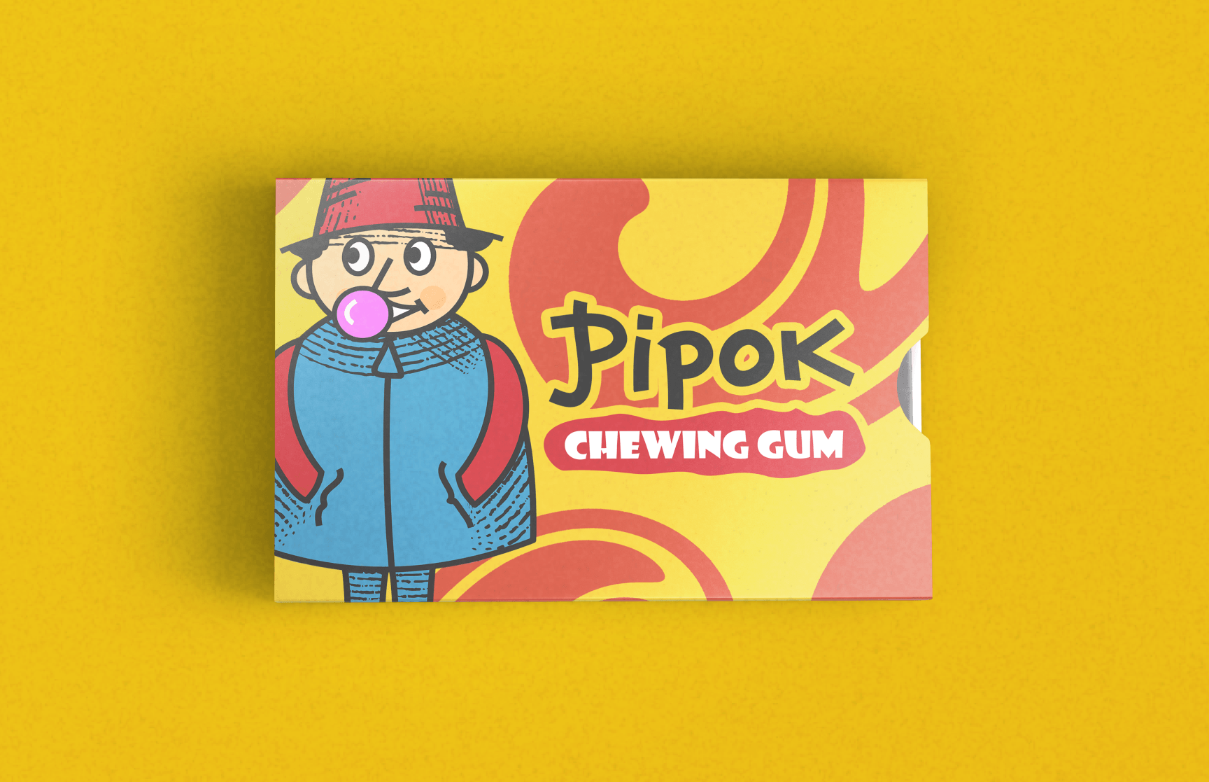
Pipok — chewing gum branding
A retro character-led identity and packaging for a chewing gum brand
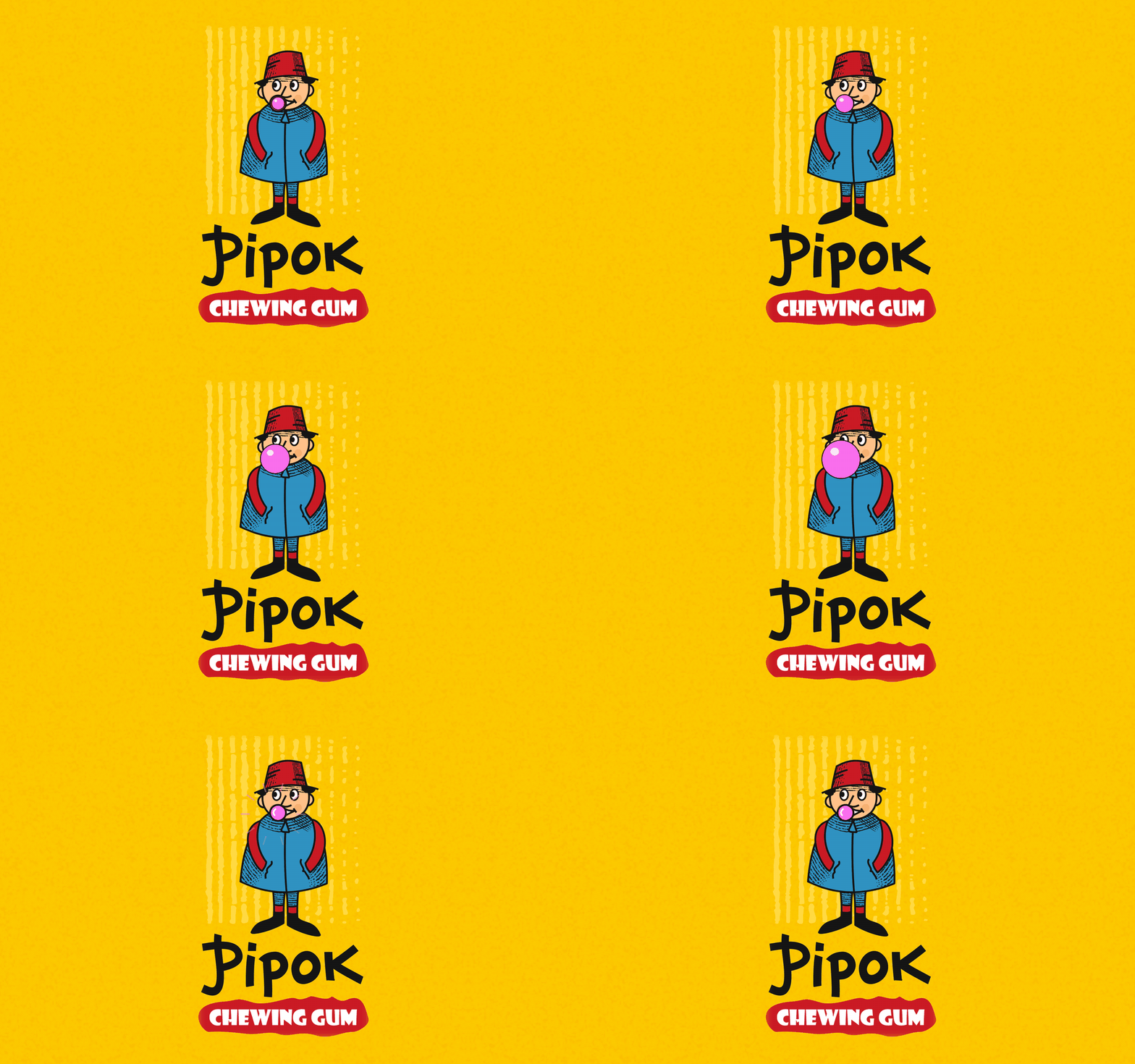
Pipok is a chewing gum with character. The brand needed an image that stands out on a shelf full of equally bright packs and sticks in memory at first sight, especially for a young audience.
Character
The hero is a boy in a red bucket hat and a blue coat, blowing a bubble. He is drawn in a retro style with hand-made hatching, like an illustration from an old children’s book. He is the face of the brand.
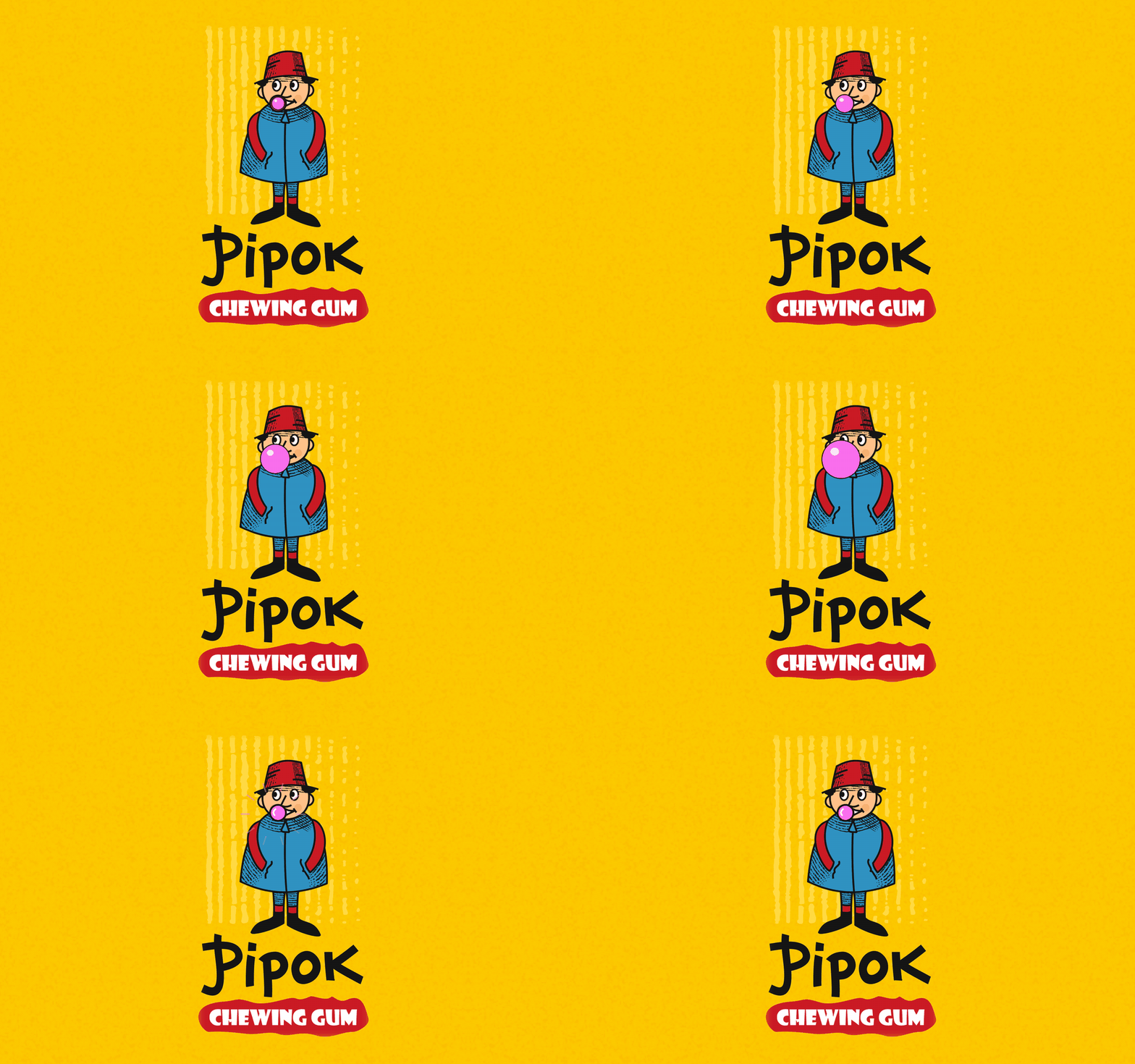
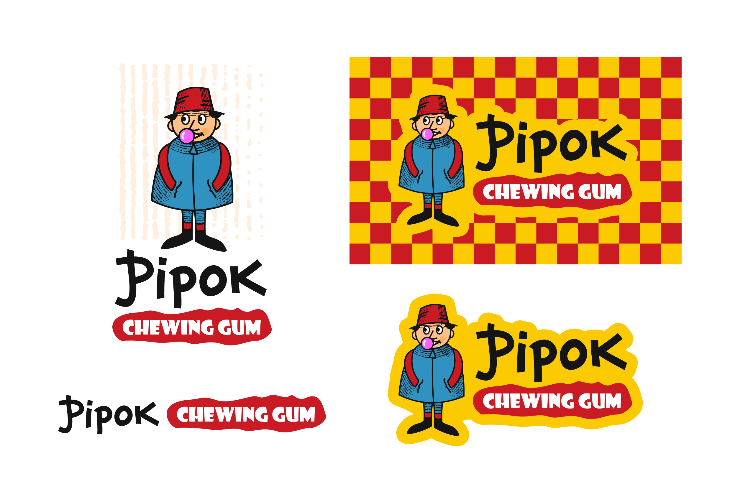
Logo and versions.
A hand-lettered “Pipok” and a “CHEWING GUM” label shaped like stretched gum. I made vertical and horizontal versions, a sticker version with an outline and a clean wordmark without the character for small sizes.
Pattern
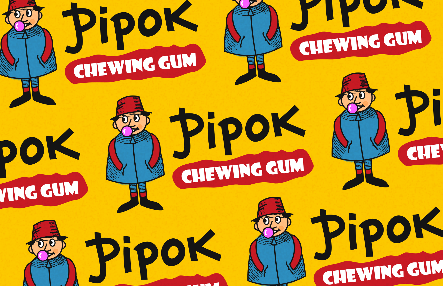
A repeating pattern of the character and logo for backgrounds, wrappers and social media.
Stickers
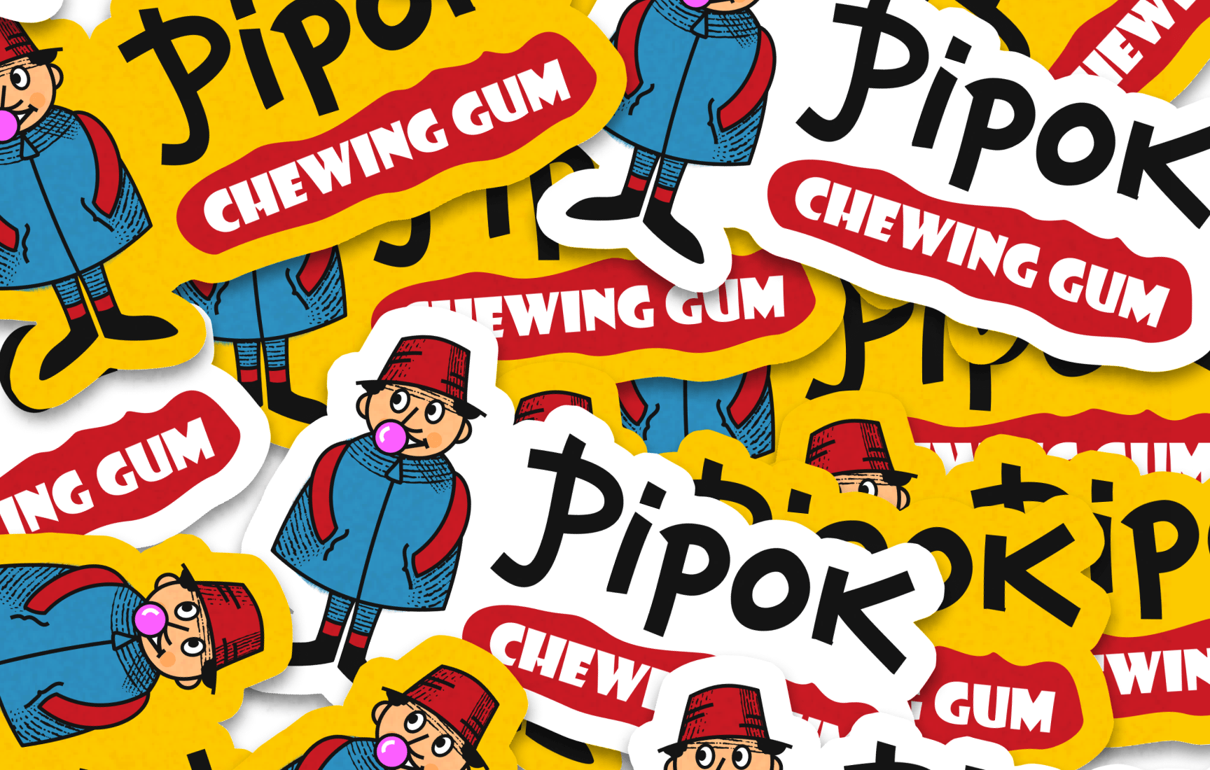
A set of stickers on yellow and white backing for merch, promo and packaging.
Packaging
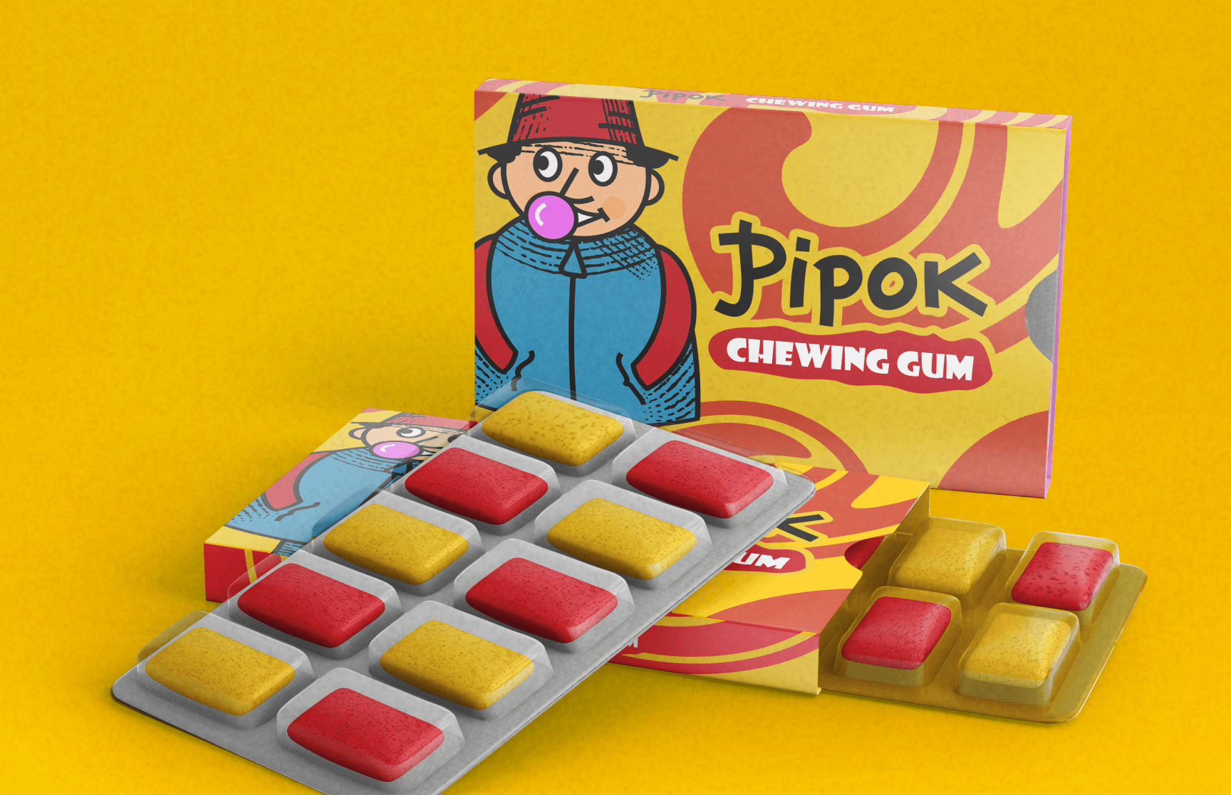
A box with a large character and strawberry-and-banana colour waves, and a blister pack with pellets in two flavours: red and yellow, matching the brand colours.
Result
A consistent brand that works on any medium, from a tiny icon to packaging and stickers. The character makes the gum easy to spot on a shelf and gives the brand a voice that is easy to build promotions, merch and posts around.