Ova — premium eyewear brand
A dark, cinematic one-page site for a concept eyewear brand: sticky scroll scenes, a four-colour collection and custom perspective lettering.
The task
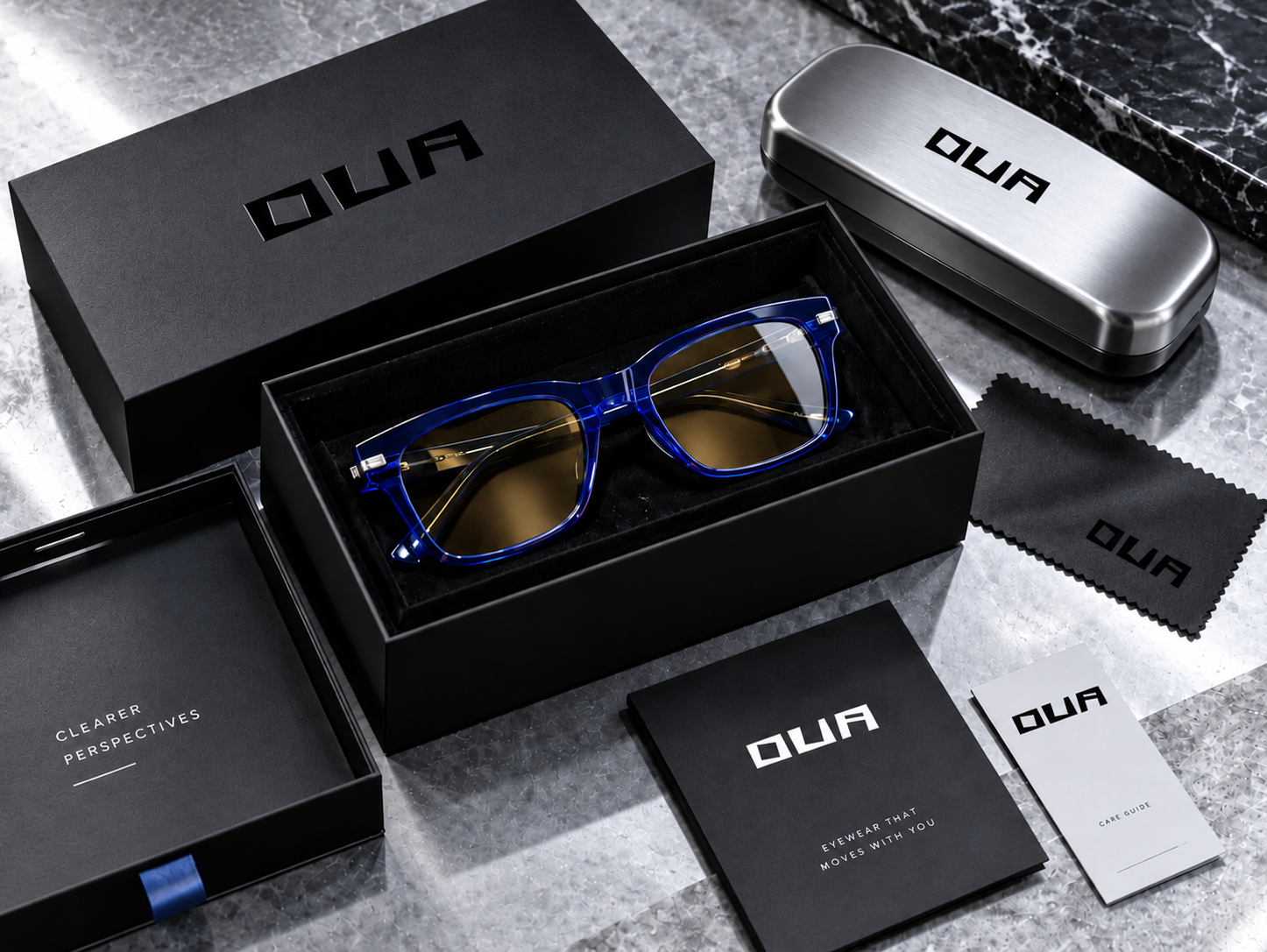
Ova is a concept brand of premium eyewear: transparent cobalt acetate, polished steel hinges and honey-tinted lenses. The landing page had to feel as expensive as the product — minimal, dark, with every screen working like a page in a fashion lookbook — and still sell: show the frame, the collection and lead to the waitlist.
The idea
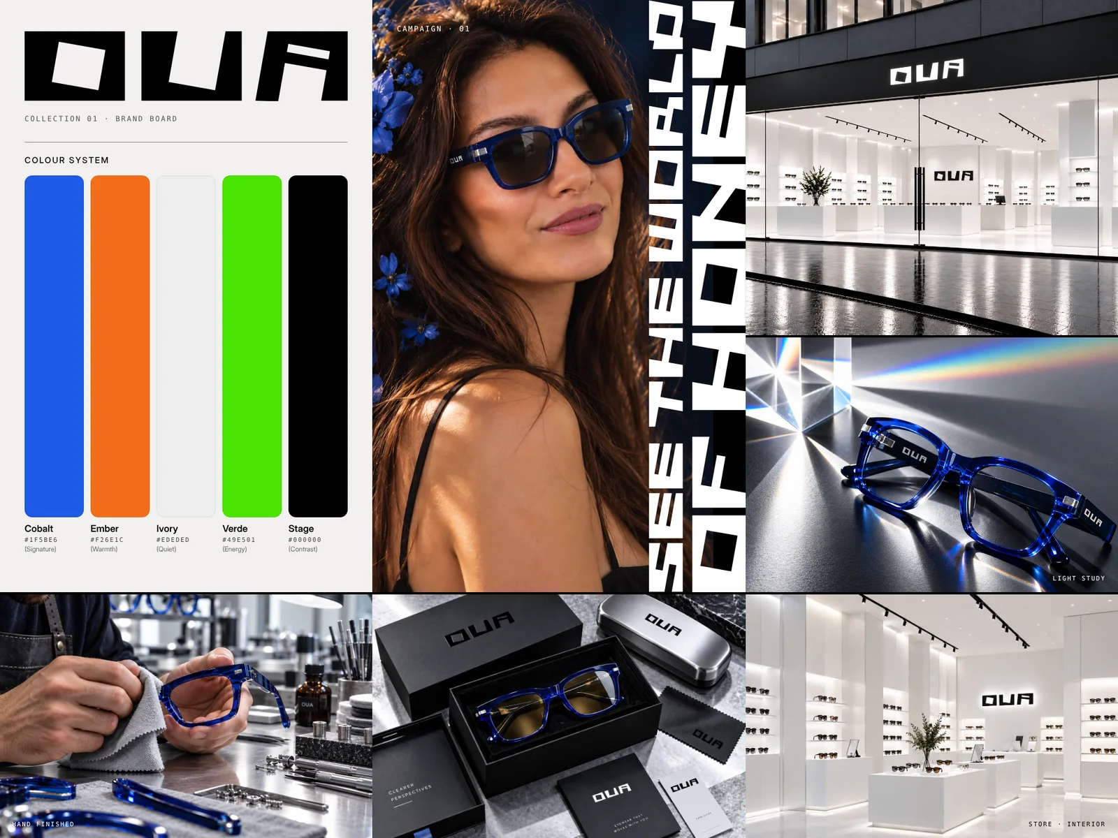
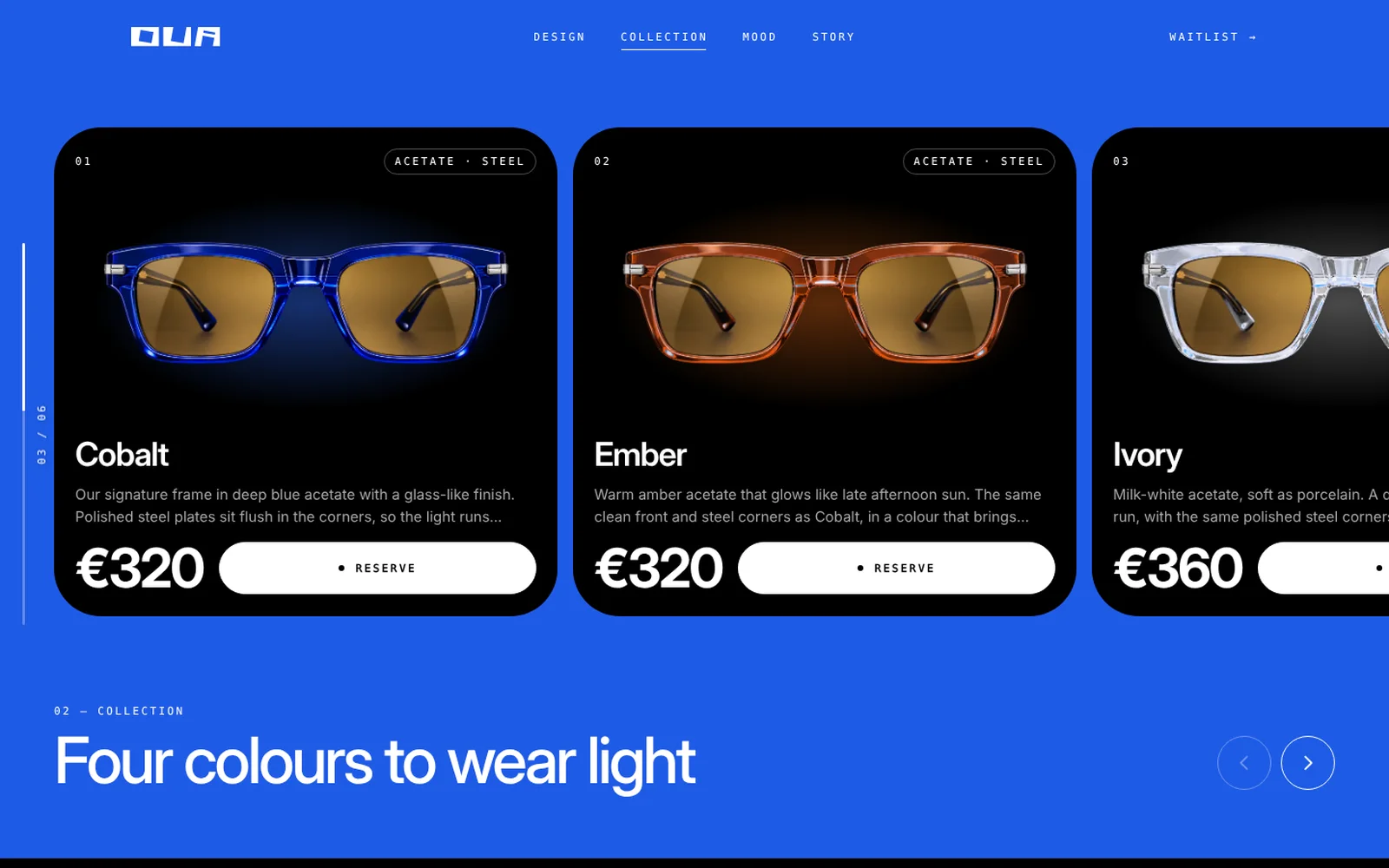
The page is built on contrast: deep black, one strong cobalt blue and big white type. Each screen is a separate scene that sticks to the viewport and changes as you scroll, so the page reads like a short film rather than a long scroll. Colour is used sparingly and always has a reason: blue, orange, white and green are the four colours of the collection.
First screen
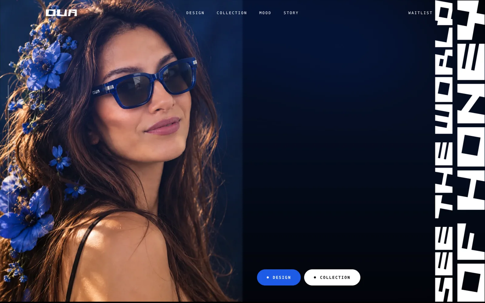
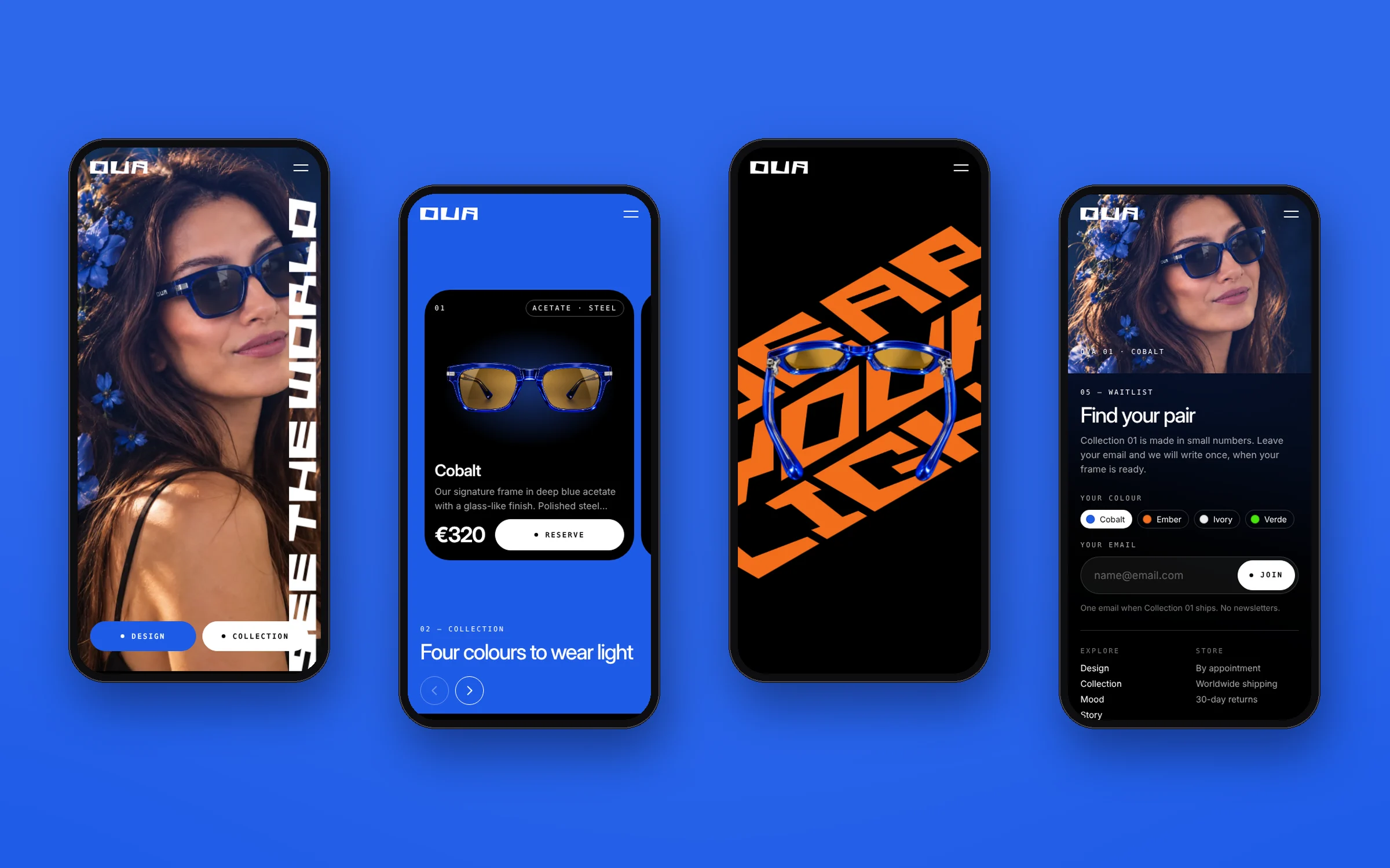
A half-screen portrait, the brand line set vertically in the custom lettering and two buttons. The page opens with the photo already there; the glasses then appear on the face, a soft blue glow drifts in the background and every few seconds a short glitch runs through the image.
Design
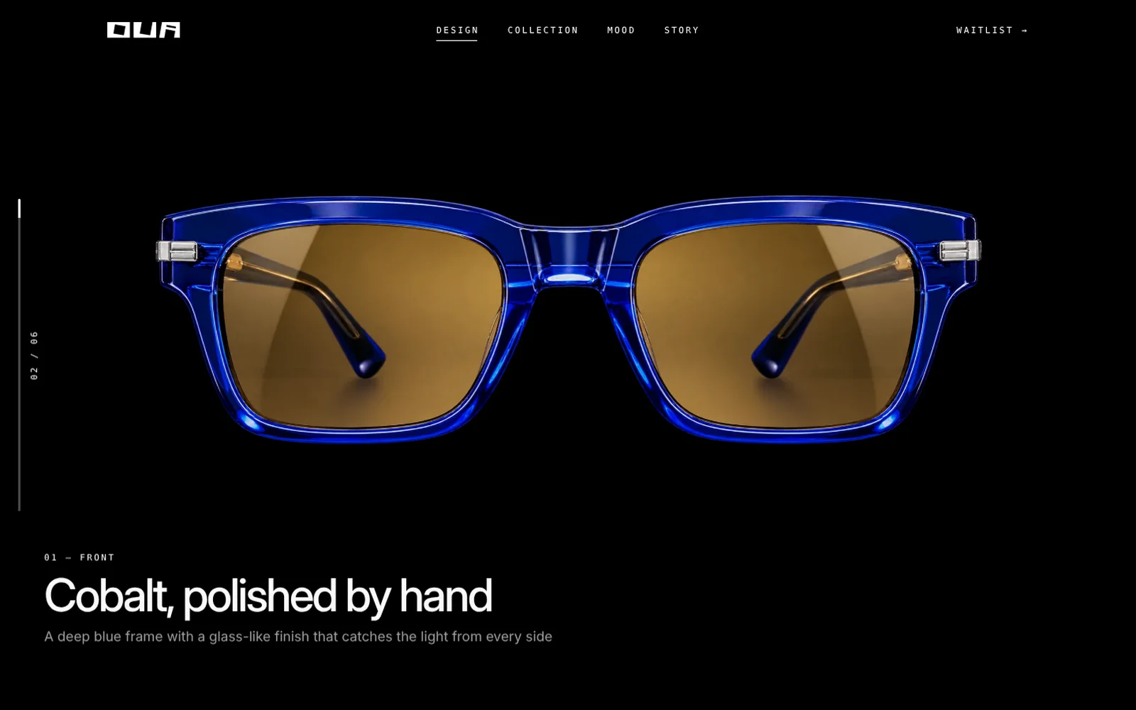
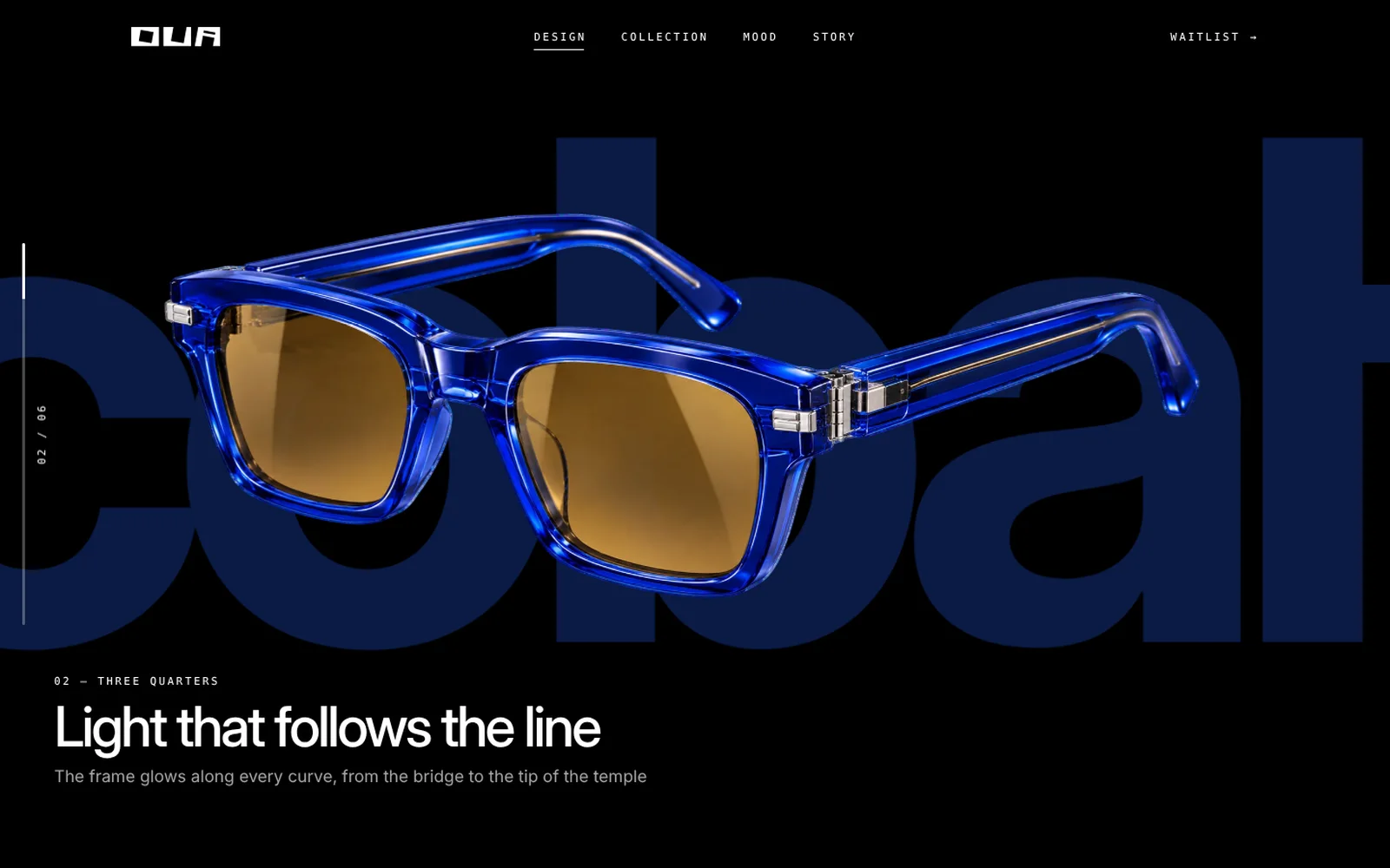
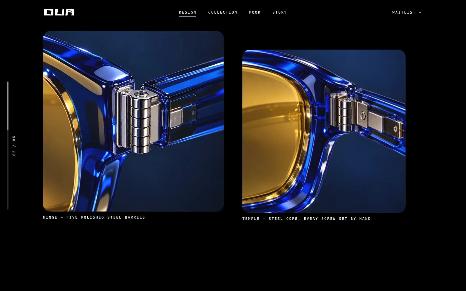
The frame turns in front of you as you scroll: front, three quarters, profile, with the word "cobalt" set huge behind it. Then the camera moves to the details — the five-barrel hinge and the steel core of the temple — with a slow parallax inside each picture.
Collection
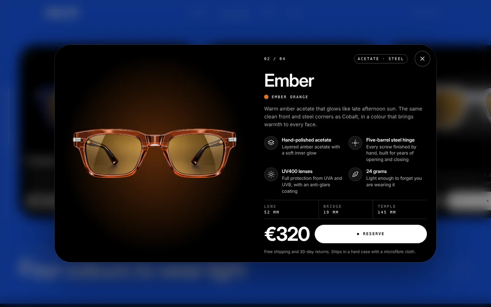
Four frames in four colours on a sideways rail. Every step changes the background of the whole screen: blue, orange, white, green. A tap on a card opens a product popup with the full description, features with icons, sizes and the price.
Mood
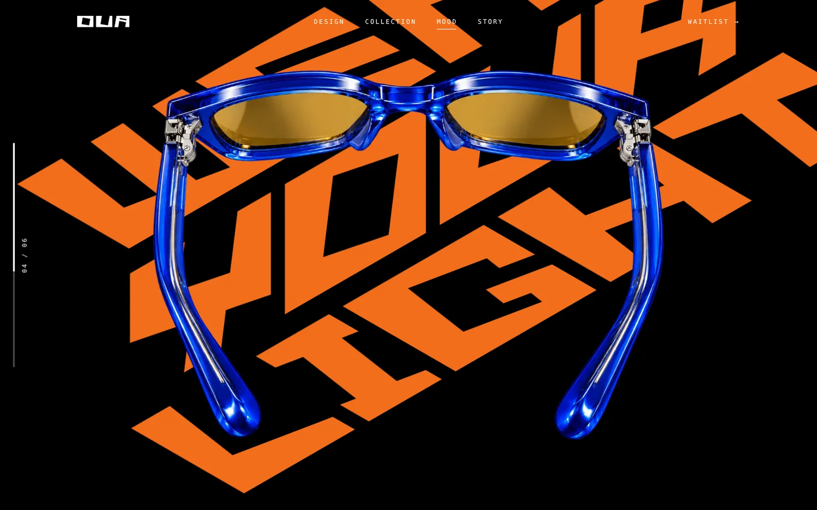
"Wear your light" is set in perspective lettering. The lines roll in one by one while you scroll and change colour through the four colours of the collection, with the frame lying on top.
Story
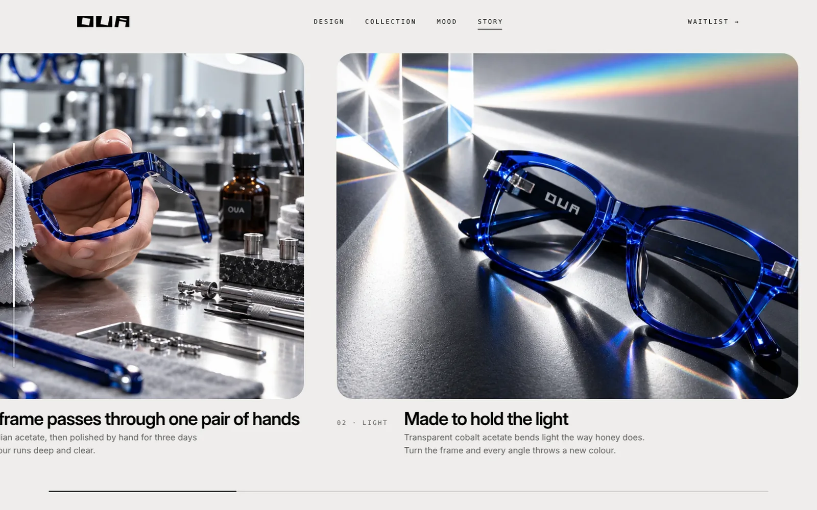
The story of one frame — from the workbench to the box and the store — is told on a horizontal strip driven by the vertical scroll. The menu follows you and underlines the section you are in.
Waitlist
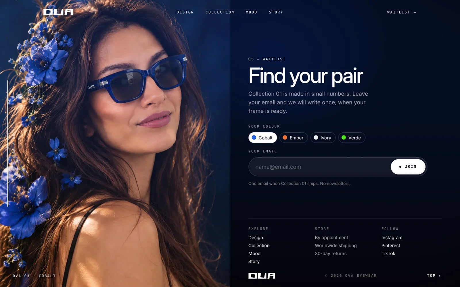
The last screen combines the form and the footer: pick a colour, leave an email, and the full footer with links sits underneath. The portrait from the first screen closes the page.
Mobile
On the phone every screen keeps its scene: the burger opens a full-screen menu, the collection fits one screen even on an iPhone SE, the lettering scales to the height of the screen.
Result
A premium one-page brand site where the product stays the hero: one accent colour per screen, large type, and motion that shows the frame instead of decorating the page.